ColdFusion Software Development Company ColdFusion Software Development Company

Archive for the ‘Mobile Web Development’ Category

Advantages of Mobile Website Optimization


Advantages of Mobile Website Optimization

The Mobile Reality

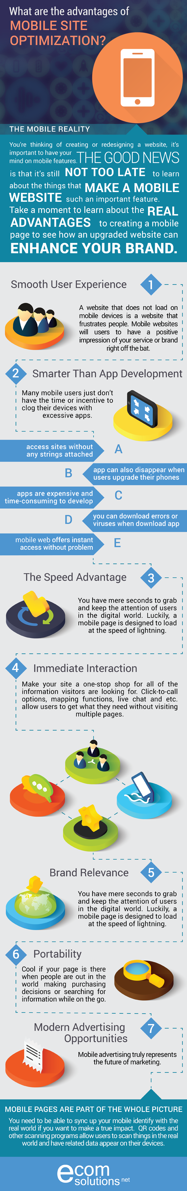
Mobile is the new reality. If you’re thinking of creating or redesigning a website, it’s important to have your mind on mobile features. It doesn’t exactly take a scientific study to realize how prevalent mobile devices are in today’s society. People of all ages are now interacting with friends, family members, celebrities and brands in a continuous loop using mobile devices. Not upgrading your brand’s online identity to a mobile platform is like asking to be ignored. Of course, you can’t just throw together a quick mobile site and hope for the best. You need to be proactive about crafting an efficient, engaging site that gives users what they’re looking for immediately. If you’ve been putting off going mobile, time is running out before you get left behind in a big way. The good news is that it’s still not too late to learn about the things that make a mobile website such an important feature. Take a moment to learn about the real advantages to creating a mobile page to see how an upgraded website can enhance your brand.

Smooth User Experience
A website that doesn’t load on mobile devices is a website that frustrates people. As any marketer knows, creating a frustrating, time-consuming experience for people is a huge mistake. How does a mobile site help when someone is browsing your page in a hurry? Mobile websites are specifically designed to display beautifully on mobile devices. If you rely on a normal website, your visitors will be left dealing with images that are choppy or unable to load. Research in the world of website usability shows that pages that are optimized for mobile use result in significantly higher levels of satisfaction among users. That elevated level of satisfaction will cause users to have a positive impression of your service or brand right off the bat.

Smarter Than App Development
Do you know how much incentive it takes to click on an app and download it? It is kind of hard to believe that brands were scrambling to develop clunky apps just a few short years ago. The theory was that a brand needed to have a customized app for users to download. It didn’t take very long to realize that many mobile users just don’t have the time or incentive to clog their devices with excessive apps. Users want to access sites without any strings attached. A mobile site is far superior to an app because it offers instant access without very much thought. The big problem with apps is that they are expensive and time-consuming to develop. What’s more, an app can quickly become outdated and need upgrades. You’ll already have headaches to deal with before you even get into the topics of bugs, download errors or viruses. Apps can also disappear when users upgrade their phones. It goes without saying that website apps just aren’t customer-friendly.

The Speed Advantage
In this fast-paced world, a person could lose interest in your website between the time they click on a link and the time a first image loads. There are simply too many amazing things happening on the Internet for people to wait around for your slow page to load. This makes it very important for you to know that websites that aren’t optimized for mobile use load much slower than websites that are. You have mere seconds to grab and keep the attention of users in the digital world. The reality is that fickle users could be jumping to a competitor’s website by the time yours can display fully. Luckily, a mobile page is designed to load at the speed of lightning.

Immediate Interaction
Why put obstacles in the way of a user looking to purchase or consume what you’re putting out there. Make your site a one-stop shop for all of the information visitors are looking for. Click-to-call options, mapping functions, live chat and other features allow users to get what they need without visiting multiple pages. Location-aware technology can also provide you with a huge boost because it will connect nearby users to your website. (more…)

Responsive Design on the ColdFusion Environment

As the amount of internet traffic served to mobile devices is on the rise, Responsive web design is becoming more and more important. The mobile trend is so popular that Google has started penalizing websites that aren’t mobile-friendly, and will boost the ones that have a Responsive mobile architecture, especially for searches originating on a mobile device. Let’s admit it: people like to be confortable and they are likely to be on the run, favoring the use of mobile devices. Meaning in the near, as well as the far future,  mobile usage (this includes mobile phones and tablets) will surely surpass desktop usage globally. (more…)

Designing a Mobile-Friendly Website

How to build Mobile-Friendly Websites

According to Thomas Petty, President of Bay Area Search Engine Academy, there are three ways to build mobile-friendly websites:

(1)    Using the latest Cascading Style Sheets, a website design that is mobile-responsive can be set up by you. This mobile device display’s optimization method is preferred by Google and allows for the rearranging, displaying or hiding of information across various devices. The devices include smartphones and desktop PCs. Petty claims that the content is simply hidden or rearranged depending on which device, but all content is equally served. (more…)

Will the New Google Algorithm Find Your Website Mobile-Friendly?

PrintGet Ready for New Google Algorithm Change: Mobilize or Be Penalized

In today’s market, corporations are well aware of the grave effects algorithm changes of Google can have. Having suffered when some such as Demand Media or Ask.com used SEO for bolstering their brand and ignoring the poor content they were publishing is a lesson they will not forget easily. The result of Panda, Google’s 2011 algorithmic change, led the way for the creation of higher quality writing.

Penguin, another of Google’s algorithm changes, targeted sites with poor quality links in 2012. These links led users to poor quality content and their sites were, therefore, severely penalized in ranking by Google. Basically, irrelevant information caused sites to suffer with ranking in Google.

The word is out for Google’s next algorithm change. If your site is not mobile-friendly by April 21st, it will be penalized in its ranking. It may actually be removed from the mobile search index of Google. Maybe your site looks great and works well when a person visits it from a desktop computer, but how does it look and work from a cell phone or tablet? You most definitely should check this out and make necessary changes by April 21st.

What is Google’s reason for this new algorithm change? Since consumers are using mobile devices more and more, Google believes that businesses should get in step with the times. Sites will now be ranked according to the convenience they offer to the mobile-user. The ranking elements Google will be using are listed below.

Sites must:

  1. Avoid software such as Flash which is not usable on mobile devices. According to Adobe, “Flash Player for mobile devices is officially dead”.
  2. Use readable text without zooming.
  3. Size content to allow users to view it on the screen without having to zoom or scroll horizontally.
  4. Space links apart far enough to allow the correct link to be easily tapped.


Mobilegeddon Is Here!

When conference speakers at last month’s Search Marketing Expo (SMX) West were asked their main takeaways, one response was definitely a sign of the times. “Mobile, mobile, mobile,” was the answer of the senior manager of content marketing for Kenshoo, Kelly Wrather. “I want to grab every website designer and tell them mobile is the thing! It’s the only thing!”

A frequent discussion topic at previous SMX shows has been mobile-optimized websites’ importance. However, this year a sense of urgency was apparent since “Mobilegeddon,” as it is called by some, was due to arrive anytime.

For the past two years, a search ranking factor has been website mobile-friendliness. According to founder and CEO of AudienceBloom, Jayson DeMers, “Websites that aren’t mobile-friendly will see a more negative impact in search visibility than they may already be seeing, and mobile-optimized sites may be rewarded even greater in search rankings.”

Google noted in its June, 2013, Webmaster Central Blog it plans to initiate several ranking changes soon. Google further warned that sites misconfigured for smartphone users will be addressed by these ranking changes.

At the same time, Google pointed out two common mistakes that cause websites to convey poor mobile experiences:

Mistake # 1: Sending smartphone users to a single mobile page due to defective redirects to their site pages listed in search results — For instance, the redirects send users to the home page and not a mobile-optimized version users are seeking.

Mistake #2: Errors of only smartphones – These take place when users of smartphones click Web pages in search results’ listings and receive only error messages.

(more…)

ColdFusion 11 Overview Video

http://www.youtube.com/watch?feature=player_embedded&v=vz8j6RbT-MY

SHSAT Practice Test for iPad

SHSAT Practice Test for iPad
Very soon, New York City students will be able to practice SHSAT tests for the Math section on their iPads. As innovative as the iPad, the practice tests will be at the fingertips of the students, allowing them to take it anywhere they would like. You can find out more in our iOS / iPad Section.

What is the SHSAT Test?
Students in the 8th and 9th grade in New York city that wish to be admitted to one of the NYC Specialized High Schools must take the Specialized High School Admission Test (SHSAT). This is a timed grid / multiple-choice test that contains Math and Verbal sections. The results are computed and reported as scale scores and are based on the number of correctly answered questions combined with the level of difficulty for each question. Students are then ranked based on their scores and are assigned to a Specialized High School depending on their rank, the priority in which they elected schools, and the number seats available at each school.

Mobile Web Development

HAVE A QUESTION?

We would love to help.
Give us a call:

(718) 793-2828

Get a free project estimate:

Recent Comments
    Archives