Will the New Google Algorithm Find Your Website Mobile-Friendly?
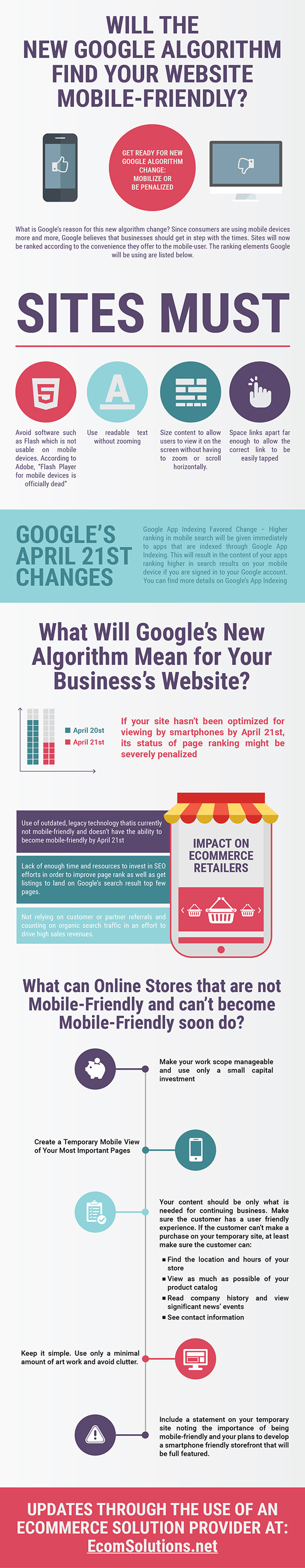 Get Ready for New Google Algorithm Change: Mobilize or Be Penalized
In today’s market, corporations are well aware of the grave effects algorithm changes of Google can have. Having suffered when some such as Demand Media or Ask.com used SEO for bolstering their brand and ignoring the poor content they were publishing is a lesson they will not forget easily. The result of Panda, Google’s 2011 algorithmic change, led the way for the creation of higher quality writing.
Penguin, another of Google’s algorithm changes, targeted sites with poor quality links in 2012. These links led users to poor quality content and their sites were, therefore, severely penalized in ranking by Google. Basically, irrelevant information caused sites to suffer with ranking in Google.
The word is out for Google’s next algorithm change. If your site is not mobile-friendly by April 21st, it will be penalized in its ranking. It may actually be removed from the mobile search index of Google. Maybe your site looks great and works well when a person visits it from a desktop computer, but how does it look and work from a cell phone or tablet? You most definitely should check this out and make necessary changes by April 21st.
What is Google’s reason for this new algorithm change? Since consumers are using mobile devices more and more, Google believes that businesses should get in step with the times. Sites will now be ranked according to the convenience they offer to the mobile-user. The ranking elements Google will be using are listed below.
Sites must:
- Avoid software such as Flash which is not usable on mobile devices. According to Adobe, “Flash Player for mobile devices is officially dead”.
- Use readable text without zooming.
- Size content to allow users to view it on the screen without having to zoom or scroll horizontally.
- Space links apart far enough to allow the correct link to be easily tapped.
Mobilegeddon Is Here!
When conference speakers at last month’s Search Marketing Expo (SMX) West were asked their main takeaways, one response was definitely a sign of the times. “Mobile, mobile, mobile,” was the answer of the senior manager of content marketing for Kenshoo, Kelly Wrather. “I want to grab every website designer and tell them mobile is the thing! It’s the only thing!”
A frequent discussion topic at previous SMX shows has been mobile-optimized websites’ importance. However, this year a sense of urgency was apparent since “Mobilegeddon,” as it is called by some, was due to arrive anytime.
For the past two years, a search ranking factor has been website mobile-friendliness. According to founder and CEO of AudienceBloom, Jayson DeMers, “Websites that aren’t mobile-friendly will see a more negative impact in search visibility than they may already be seeing, and mobile-optimized sites may be rewarded even greater in search rankings.”
Vidmate is an app that lets you download videos and songs from Vimeo, YouTube, Dailymotion, SoundCloud, Metacafe, and loads of other multimedia sites. FREE Download Vidmate App 3.08 VidMate app is an easy to use and powerful android app to download
Google noted in its June, 2013, Webmaster Central Blog it plans to initiate several ranking changes soon. Google further warned that sites misconfigured for smartphone users will be addressed by these ranking changes.
At the same time, Google pointed out two common mistakes that cause websites to convey poor mobile experiences:
Mistake # 1: Sending smartphone users to a single mobile page due to defective redirects to their site pages listed in search results — For instance, the redirects send users to the home page and not a mobile-optimized version users are seeking.
Mistake #2: Errors of only smartphones – These take place when users of smartphones click Web pages in search results’ listings and receive only error messages.
Google’s April 21st Changes
Mobile-Friendly Change — Mobile searches will be affected around the world in all languages. Hopefully, the result of this update will be to deliver a greater number of mobile-friendly websites.
Google claims their mobile-friendly algorithm will give mobile users more stress-free access to search results that are relevant and high-quality.
Google App Indexing Favored Change – Higher ranking in mobile search will be given immediately to apps that are indexed through Google App Indexing. This will result in the content of your apps ranking higher in search results on your mobile device if you are signed in to your Google account. You can find more details on Google’s App Indexing for Google Search pages at: https://developers.google.com/app-indexing/.
What Will Google’s New Algorithm Mean for Your Business’s Website?
If your site hasn’t been optimized for viewing by smartphones by April 21st, its status of page ranking might be severely penalized. This is the result of an automated, mobile-friendliness test included in Google’s search algorithm. This could mean that if your website was previously seen on Google’s first or second page, it might be pushed down considerably making room for competitor sites to be positioned above you.
A scoring penalty will be calculated by Google’s new ranking algorithm if a site does not offer both easy-to-navigate and easy-to-read smartphone devices’ user experiences. In other words, if your mobile website is plagued with slow loading, is burdened with strong imagery or has old-time showy video, the upcoming Google update will impact it negatively.
What Is the Reason for This Algorithm Change by Google and Why Now?
For years, many organization have seriously neglected supporting the optimization for smartphone support. Google has merely decided it is time to make a move to increase its commitment in encouraging better user experiences for mobile consumers.
For that reason, Google is acting to make sure that the net community intentionally accommodates the constantly increasing smartphone viewers. This perspective on the subject by Google was made public previously in February of 2013, and therefore there should be no need for any additional time for site owners to adapt to the new requirements.
Jon Marsella at Jasper Interactive Studios, an ecommerce enterprise solution provider, reports that at Jasper they have observed website traffic originating from a mobile device has increased since 2010 almost 30% yearky. As a result, at Jasper they have changed a huge majority of their clients’ sites to ones that possess capability to be fully responsive to mobile devices. This was done by either undertaking a bigger scale enterprise platform or merely setting up new stores using modern SaaS-hosted shopping platforms that are mobile-friendly such as Bigcommerce.
Impact on Ecommerce Retailers
Google’s new algorithm will have a huge impact on ecommerce retailers due to the following:
Use of outdated, legacy technology that is currently not mobile-friendly and doesn’t have the ability to become mobile-friendly by April 21st.
Lack of enough time and resources to invest in SEO efforts in order to improve page rank as well as get listings to land on Google’s search result top few pages.
Not relying on customer or partner referrals and counting on organic search traffic in an effort to drive high sales revenues.
It will be a very difficult challenge for large enterprises to prepare sufficiently for this update. This is largely because enterprise commerce cycles of publication are characteristically very slow. They involve development cycles that are long, quality assurance timelines that are lengthy, legality delays, politics internally and third party organizations dependencies. Sadly, a great many organizations simply will not be able to change quickly enough.
What can Online Stores that are not Mobile-Friendly and can’t become Mobile-Friendly soon do?
Of course, the best solution would be to quickly adapt for mobile viewing. However, that simply is not realistic. There just isn’t enough time.
The best, realistic approach would most likely be to consider a task force within your organization or an outside agency for a short term. You can work with them in order to produce a good stop-gap solution.
Create a Temporary Mobile View of Your Most Important Pages:
(1) Make your work scope manageable and use only a small capital investment.
(2) Your content should be only what is needed for continuing business. Make sure the customer has a user friendly experience. If the customer can’t make a purchase on your temporary site, at least make sure the customer can:
- Find the location and hours of your store
- View as much as possible of your product catalog
- Read company history and view significant news’ events
- See contact information
(3) Keep it simple. Use only a minimal amount of art work and avoid clutter.
(4) Include a statement on your temporary site noting the importance of being mobile-friendly and your plans to develop a smartphone friendly storefront that will be full featured.
A good idea for this temporary site would be to make the content fun and engaging. You shouldn’t apologize either since you haven’t committed a crime. Remember, there are lots of other competitors in the same boat as you are, and many of them most likely will not bother to thoughtfully inform their customers.
Keep your budget in mind with the creation of this temporary site. It wouldn’t be a good idea to invest more than 25% of your time on its initial content and layout.
Using Google’s own online mobile-friendly validation utility, you can test your mobile site along the way several times at: https://www.google.com/webmasters/tools/mobile-friendly/. This utility will show how this site will hold up to Google’s new algorithm’s mobile scoring rules. It will also offer some understandings of any possible problems with its design. Hopefully, this will save your main storefront from the impact of the ranking penalty for the time being.
You should definitely consider starting a larger and more meaningfully scoped project plan in order to make your storefront complete with smartphone and mobile acceptance.
Avoid seriously affecting site traffic with future algorithm or technology updates through the use of an ecommerce solution provider at: http://www.EcomSolutions.net